Letterbox and Pillarbox Size Calculator
A 4:3 source fitted inside 1920 × 1080 becomes 1440 × 1080. It needs 240 px pillarboxes on both the left and right, with 0 px on the top and bottom. The fitted picture keeps its ratio and uses 75% of the container area.
Direct answer: 1440 × 1080 content + 240 px side bars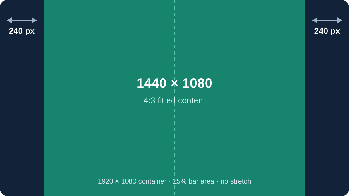
Audit the 4:3 into 1920 × 1080 result
The width-limited scale would be 1920 / 4 = 480, but that would make the picture 1440 px tall and overflow the container. The height-limited scale is 1080 / 3 = 360, so the fitted rectangle is 4 × 360 by 3 × 360, or 1440 × 1080. Subtracting its width from the container leaves 480 px. Centering divides that space into 240 px on each side.
The picture area is 1440 × 1080 = 1,555,200 square pixels. The container area is 2,073,600 square pixels. The image therefore occupies exactly 75%, while the two bars occupy 518,400 square pixels, or 25%. Cross multiplication confirms that 1440:1080 reduces to 4:3.
Formula for a centered contain fit
Scale: s = min(Cw / a, Ch / b)
Content rectangle: Fw = a × s, Fh = b × s
Side bars: L = R = (Cw - Fw) / 2
Top and bottom bars: T = B = (Ch - Fh) / 2
Here a:b is the source width-to-height ratio and Cw by Ch is the container. Taking the smaller scale is the key: both fitted edges remain inside the container. When Cw / Ch is wider than a / b, the leftover space is horizontal and the result is pillarboxing. When the container is relatively taller, the leftover space is vertical and the result is letterboxing.
Fractional bars are valid layout geometry. A renderer may ultimately distribute whole device pixels unevenly when the total remainder is odd. This calculator keeps the exact centered value so that rounding is visible instead of silently hidden.
Four independently calculated fit tests
| Source → container | Fitted content | Bars per side | Unused area |
|---|---|---|---|
| 4:3 → 1920 × 1080 | 1440 × 1080 | Left/right 240 px | 25.000% |
| 2.39:1 → 1920 × 1080 | 1920 × 803.347 | Top/bottom 138.326 px | 25.616% |
| 16:9 → 1080 × 1920 | 1080 × 607.5 | Top/bottom 656.25 px | 68.359% |
| 1.85:1 → 2048 × 1080 | 1998 × 1080 | Left/right 25 px | 2.441% |
The 2.39:1 test uses 1920 / 2.39 = 803.347280 px of height. The remaining 276.652720 px splits into two 138.326360 px bars. The portrait-container test is more severe: a 16:9 image occupies only 31.640625% of a 1080 × 1920 frame when the entire landscape image must remain visible.
The 1.85:1 case is a useful exact check because the height constraint gives a scale of 1080. Multiplying 1.85 by 1080 gives 1998 exactly, leaving 50 px and two 25 px pillarboxes.
Letterbox or pillarbox?
Letterbox bars run across the top and bottom. Pillarbox bars run down the left and right. A centered contain fit produces only one pair unless the source and container ratios match, in which case all four values are zero. The terms describe where the unused container area appears, not the orientation of the source by itself.
For web images or video, the same geometry corresponds to a contain fit. The container background supplies the visible bar color. A cover fit answers a different question because it fills the box by cropping content instead of preserving the complete frame.
Letterbox and pillarbox questions
How do I remove black bars without stretching?
Fill the container with a cover fit and accept cropping, or change the container ratio to match the source. A complete mismatched frame cannot fill the box without either bars, cropping, or distortion.
Why does the calculator show half pixels?
Centered layout can produce fractional coordinates. A pixel-based export must choose a rounding policy, and odd leftover totals may require one side to differ by one pixel.
Are bars always black?
No. The calculation measures unused space; the renderer, editor, or CSS background determines its color.
What happens when the ratios match?
The fitted rectangle equals the container, the scale is the same on both axes, and every bar is zero.
Sources
References checked on October 26, 2026: the W3C contain-constraint definition, the MDN object-fit reference, and the FFmpeg pad-filter documentation. The formulas, area measurements, test cases, comparisons, and SVG above were independently produced for this page.